Published · Updated
One of the bittersweet traits a designer can possess is never being fully satisfied with their own work. This notion resonates with developers as well, to a large extent.
As interfaces evolve, there arises an insatiable thirst to optimize every aspect of the UI, with the haunting refrain of “it’s so X year” echoing in the minds of developers striving to distinguish their creations.
Occasionally, it’s refreshing to take a step back and appreciate the simplicity of things. That’s essentially how this portfolio design came to be, yet even so, it fell short!
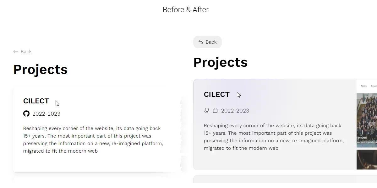
A few months back, precisely three, I put the finishing touches on my relatively straightforward and swift design, introduced the /experience page, and called it a day. However, upon revisiting it now (pre-Jan 21), it feels lacking in pizzazz. Recently, I stumbled upon an intriguing post on LinkedIn that caught my attention—a clever approach to glowing borders by Jhey Tompkins (https://www.linkedin.com/in/jheytompkins/recent-activity/all/), which immediately sparked a lightbulb moment: “This will look gooooood on the light/dark mode I’ve implemented for the portfolio.” And so, the changes began!
A minor visual overhaul, nothing too extravagant, but it brought the website into alignment with what it had been missing, ever so slightly.